Functional Paper Configuration — Dev Log 3
The final Dev Log is about configuring Functional Paper. Two big topics are discussed: configuring environment variables and customizing the styling to your liking.

Notice: The analysis is done on the v1.3 release of Functional Paper. Some things may change in later releases. The entire source code for the release is available on GitHub.
This is the third part of a series that takes a deep dive into Functional Paper, an Astro theme I developed. I used it as the basis for MachineLogs.IO. You can check out the prior posts in the series:
- Functional Paper Theme Introduction
- Functional Paper Code Analysis — Dev Log 1
- Functional Paper Integrations — Dev Log 2
Environment Variables
These store important key-value pairs for configuring various parts of the website. Instead of hard-coding parameters in the components, such as the site domain or social media links, it’s a much better approach to have them defined in a single place and inserted as environment variables at build time.
There are two methods that I use to store environment values. The first one is via the .env file. Astro has built-in support from Vite for environment values through this .env file. For local development, this is my method of choice.
The second method I employ is leveraging the Environment Variables configuration options in Vercel. In production environments, I went with this approach because of the increased flexibility. In case I need to change one of the values, I will log in my Vercel account, edit the entry, and redeploy. No additional commits are needed in GitHub.
Let’s discuss the environment variables used in Functional Paper as seen in the .env file:
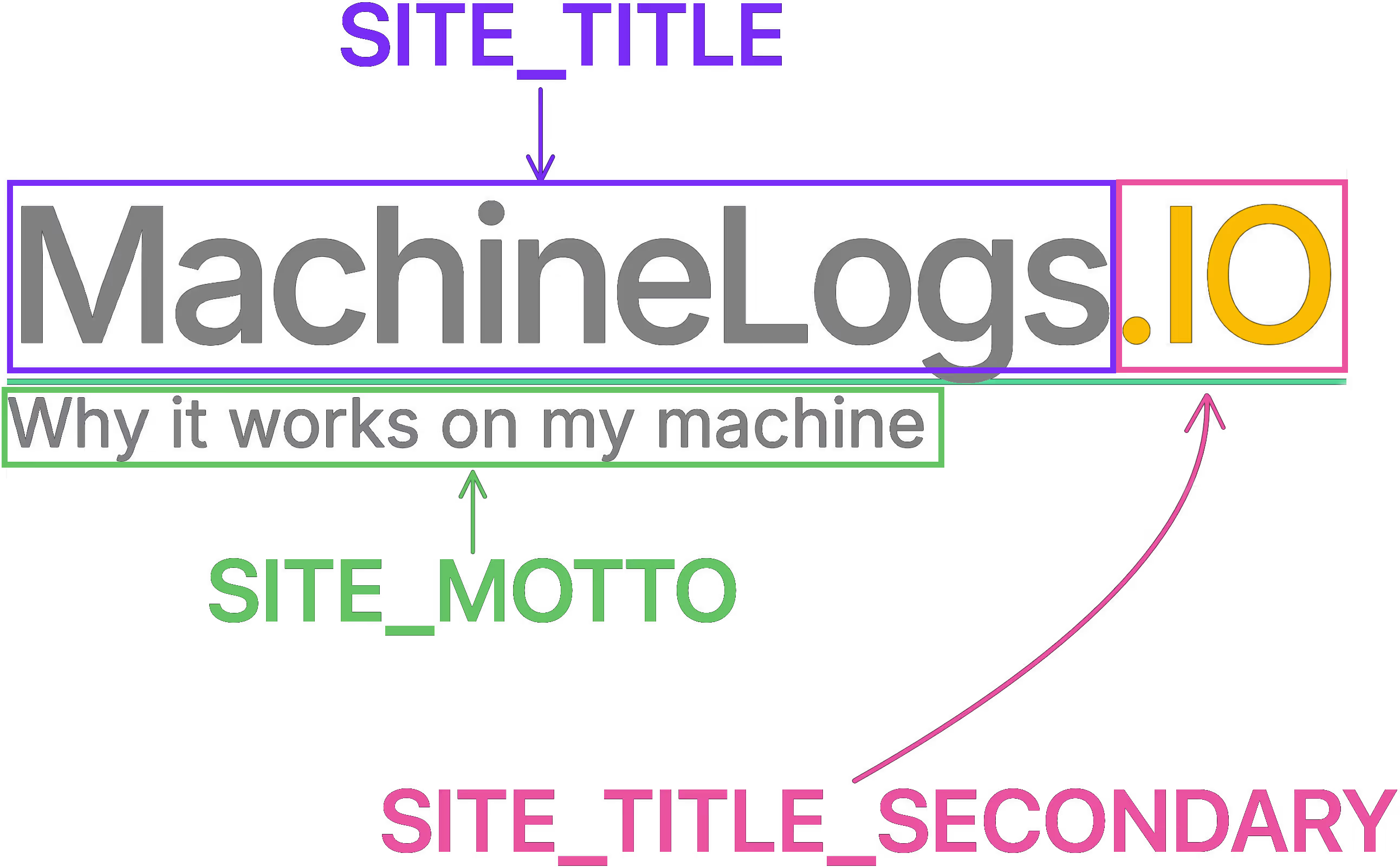
SITE_LINK— the base website URL, needed by Astro to generate all other URLs;SITE_TITLE— the first part of the site title, written in the header left justified in white or black font, depending on the selected theme;SITE_TITLE_SECONDARY— the second part of the site title, written in the header in yellow font;SITE_MOTTO— a short sentence shown in the header below the site title;
PAGE_SIZE— the maximum number of post cards to be shown on the home page, blog pages, or tag pages. If it is the last page, and the total number of posts is not divisible byPAGE_SIZE, the number of post cards displayed is lower;MAX_TAGS_DISPLAYED— the maximum number of tags that can be displayed on a post card before trimming;- Giscus config; the environment variables in this part have direct equivalents in the giscus attributes, as I’ll show. You will get the values required after following the giscus setup guide or the self-hosting guide. The environment values are as follows:
GISCUS_APP—src, source for the giscus client script;GISCUS_DATA_REPO—data-repo, the GitHub repo from where you will use the Discussions page to host the comments section;GISCUS_REPO_ID—data-repo-id, the ID for the repo from above;GISCUS_DATA_CATEGORY—data-category, the name of the category under which the threads for comments will be created;GISCUS_DATA_CATEGORY_ID—data-category-id, the ID for the category described above.
- Social media links; these populate the footer with icons which link to your social media accounts. In case the value is set to the placeholder
"#!", that social media platform is ignored, and the icon will not show up in the footer. You can add more social media platforms by modifying thefooter.astrocomponent using the previously implemented ones as examples. Currently, the supported social media accounts by environment variable are:SOCIAL_GITHUB— your GitHub profile link;SOCIAL_LINKEDIN— your LinkedIn profile link;SOCIAL_YOUTUBE— your YouTube channel link;SOCIAL_INSTAGRAM— your Instagram profile link;SOCIAL_TIKTOK— your TikTok profile link;SOCIAL_TWITCH— your Twitch channel link.
Styling Customization
We discussed in the previous Dev Log post that there are two Tailwind integrations used: Tailwind CSS and Tailwind Typography.
Let’s start the analysis with the former. For Tailwind CSS, customization is split into many files. Firstly, the default Tailwind theme is extended with a few custom colors to be used across the site, you can check them here. I suggest playing around with some values to see how each color influences the look of the site. If you are looking for some inspiration, I recommend checking Color Hunt, they have some nice color palettes to inspire your sites’ look.
Secondly, there is a global.css file shared between all pages. At line 7 I focus on font styling and setting the site background. Then, at line 10 you can see a trick I found to avoid content shift when the scroll bar appears, by accounting for that space from the beginning:
html {
	margin-left: calc(100vw - 100%);
}
The last part to mention in this file is a component I created for hyperlink text. As those are found across the site, I’ve chosen to put it a common place.
The other stylings are applied locally in each component. You can find them between the <style> tags, such as in Hamburger.astro. You’ll see that I’ve mostly stuck to using the custom defined colors, to make it easy to customize the whole site look with edits only in tailwind.config.mjs.
The later styling package to analyze is Tailwind Typography. As we discussed in the prior Dev Log, this integration is required for styling MDX/Markdown rendered content. All the settings are present in the tailwind.config.mjs file from line 13 to 64. Most of the configs are made to replicate styling from the rest of the site: maximum width, font styling, and the text color change between dark and light mode. It should be noted that you can still use the previously declared custom colors from the main Tailwind CSS integration, as I did here.
There is an exception from this MDX styling behavior. The images included in the posts are styled elsewhere. The PostImage.astro component replaces the default img element. Thus, the styling is applied directly in the component and is almost entirely created for content placement.
Custom Font
For Functional Paper, I’ve stuck to using the default font families from Tailwind CSS. But for MachineLogs.IO I’ve decided to use a custom font family, aka typeface. Let’s see how I made it work.
I came across Inter typeface and it caught my eye. It was easy to add it to the project as a NPM package through inter-ui. Next came some minor code changes; in tailwind.config.mmjs the theme needs to be extended for the font family:
// tailwind.config.mjs
fontFamily: {
    sans: ["Inter var",
    "Inter",
    ...defaultTheme.fontFamily.sans,],
}
And in the same file the typography font needs to be updated:
fontFamily: theme('fontFamily.sans').join(', ')The other file to update is global.css. You must add an import statement at the top for the font package and switch the body font to the new font-sans:
@import 'inter-ui/inter.css';
...
	body {
	    @apply font-sans ...;
	}
...
You’ll see the site has a new font look afterward. The font typeface is a personal choice, so look around for something that you like and feel that it expresses your personal touch.
Closing Remarks
This post concludes the Functional Paper Dev Log series. I hope you found the information useful, and got to play around with the code.
Some Functional Paper posts may show up from time to time when I add improvements that are worth noting. Otherwise, expect to see more varied content going forward. See you then!