Functional Paper Code Analysis — Dev Log 1
In this post, we will analyze the code structure, what each file does, and some tricks and tips used during development to optimize for storage size, responsiveness, and code maintainability. You'll also understand where you could start if you want to extend the theme.
Notice: The analysis is done on the v1.3 release of Functional Paper. Some things may change in later releases. The entire source code for the release is available on GitHub.
This is the first part of a series that takes a deep dive into Functional Paper, an Astro theme I developed. I used it as the basis for MachineLogs.IO. For an overview of Functional Paper, I have a precursor introductory post, which you can check out here.
Coding in Astro
Astro is a web framework for creating content-driven websites. In this case, it is used in its static site generator, SSG, mode.
The language uses a JSX-like syntax. If you have previously written React code, you will feel right at home. Even with just plain HTML and JavaScript, or TypeScript, experience, I think you will find the transition easy.
In Astro, you have the option to use either JavaScript or TypeScript. I have a personal preference for statically typed variables, so I went with TypeScript.
To start using Astro, please first check the prerequisites. For package management, I use npm. To start working locally with Functional Paper, you can set up a new project with it:
npm create astro@latest -- --template vlad77ivan/functional-paperFor a step-by-step guide, follow the How to Use It section from the overview post.
During your development time, you will find useful these commands:
# Run in development mode.
# Site is accesible at http://localhost:4321/ and any change made is shown live.
npm run dev

# Same as above, but you publish your site in your network.
# For example, you would need this for testing on your mobile device.
npm run dev -- --host

# Build the site, by default the output is put in the dist directory.
# It also generates the pagefind search index.
npm run build

# Run a web server for the built version in dist directory.
npm run preview

# Copies pagefind index from dist to public directory for use in dev mode.
# A post change requires a build and devindex for the new text to show up in search.
npm run devindex
Project Structure
In Astro, there are usually 4 major directories in src/ to structure the source code. These are components/, layouts/, pages/, and styles/. The last one will be analyzed in the styling Dev Log, now we will focus on the first three.
Components
Here reside the reusable blocks. Web page sections that are reused across the same page or across multiple pages should be created as components to prevent code duplication and thus increase maintainability.
Author.astro is used wherever the author of the post is mentioned. In Functional Paper, it only links to the /about/ page. But having it as a separate component makes it easier to extend the functionality later if needed.
Comments.astro stores the logic for displaying the comments section. We will talk about how the comments section is created using Giscus in the next Dev Log post.
Footer.astro is displayed at the bottom of every page on the site. I chose to add hyperlinks to Astro and the theme’s source code. Additionally, it includes clickable social media icons, and an icon to get the RSS feed. The icons are from Font Awesome, which I highly recommend. They have cute designs, and you can get others with the same style to add more social media platforms than the ones I included. Each social media entry is wrapped in an if statement, so if there is no link defined in the environment variables file, that icon will not be shown on your site.
Hamburger.astro is the mobile specific menu. It has a “hamburger” design, with the list of options sliding from the right. Between the page options, we also have the ThemeToggle component for swapping light and dark modes. It’s important to note the overflow-y-hidden overscroll-y-contain properties on the top label tag. These options prevent the user from scrolling the page while the menu is open, improving the user experience.
Header.astro is used at the top of every page. It makes use of the above Hamburger component for mobile display, but for desktop layout, it uses the Navigation and the ThemeToggle components. The ThemeToggle button needs some added JavaScript to function properly. This can be found in the <script> section. It can be split into three parts:
- runAfterLoad() function, from lines 27 to 56. Here is the logic for swapping and applying either the dark or light theme. When the user interacts with the button, an event listener is added to the button to run the theme swap.
- From lines 49 to 56, we have the logic to apply the runAfterLoad() function. It needs to run after the page is loaded. The first branch of the if statement treats the case when the loading is complete as the check is done and runs runAfterLoad() immediately. For the else case, when loading is incomplete, the built-in
astro:page-loadevent is used to add an event listener that will run the function at the end of the page navigation. - An event listener for the
astro:after-swapis added from lines 58 to 62.astro:after-swapis triggered before the page is visible to the user. This is the best time to apply the theme, as it prevents flickering for the user when the dark theme is selected.
LatestCard.astro is a container for highlighting the most recent post on the homepage. Features a different layout than the more simple cards in the list of posts and a much bigger image size.
Notable is that for displaying images, the Image component provided in astro:assets is used. The format chosen was AVIF with a mid quality. AVIF is a fairly new standard released in February 2019, and as of January 2024, it is supported on the latest devices and major browsers. It creates smaller-sized images with the same visual quality as other formats, such as WebP. Further delivery optimization is done using the sizes property. It creates an srcset, so the browser will embed an image with a resolution only as big as necessary for that client. Astro creates all the optimized images at build time.
<Image
    src={frontmatter.image}
    alt={frontmatter.alt}
    class="latest-post-image"
    widths={[240, 540, 720, frontmatter.image.width]}
    sizes={`(max-width: 360px) 240px, (max-width: 720px) 540px,
		    (max-width: 1600px) 720px, ${frontmatter.image.width}px`}
    format="avif"
    quality="mid"
/>
NavLink.astro is a component used in the navigation menu on the desktop. The most important feature is the highlight bar. It appears when you hover with the mouse over one of the page links, or when you are on one of the pages in the menu, in which case it keeps it highlighted all the time.
Navigation.astro holds a list of NavLink components. It is the navigation menu for desktop screens.
Pagination.astro is the page selector component found near the bottom of most of the main pages. It displays the current page number and total number of pages, and it dynamically adjusts to show or hide, previous and next page hyperlinks depending on whether those exist or not from the current page.
PostCard.astro is an area-size optimized version of the previously described LatestCard component. It is used across the home page, blog page, and pages listing all posts under a tag. For the viewer, it offers a quick glance at the post metadata.
PostImage.astro is a custom component for displaying the images in the rendered MDX pages. As described in the LatestCard, it applies the same types of optimizations.
Prose.astro is a simple wrapper used on the rendered MDX content to apply custom styling. This is the recommended Astro process to apply custom styles using Tailwind Typography to rendered Markdown, in this case MDX. You can find the entire documentation here.
TagCard.astro is part of the tagging system. It’s used in LatestCard, PostCard, the post itself and the Tags page. It’s a clickable element that takes you to the first page of a list of posts which have that tag assigned. Furthermore, it supports an optional style in props for a functionality on the Tags page that we will discuss later.
ThemeToggle.astro is the moon/sun button used in the menu on both desktop and mobile to switch to a light or dark theme.
Layouts
These are more advanced components. A layout is a template with components and structure shared across multiple pages of the website. For Functional Paper, there are two layouts.
BaseLayout.astro is the layout common to all the pages on the website. Here, the head of the HTML document is set. It contains the ViewTransitions component provided by Astro. You can learn more about it in the official documentation, but for a quick summary, it provides page content updates without a full refresh and adds animations when navigating between pages.
In the body, we use the responsive Header component previously defined and the custom Footer at the end. Between those is the <slot /> element, which is filled with content at build time.
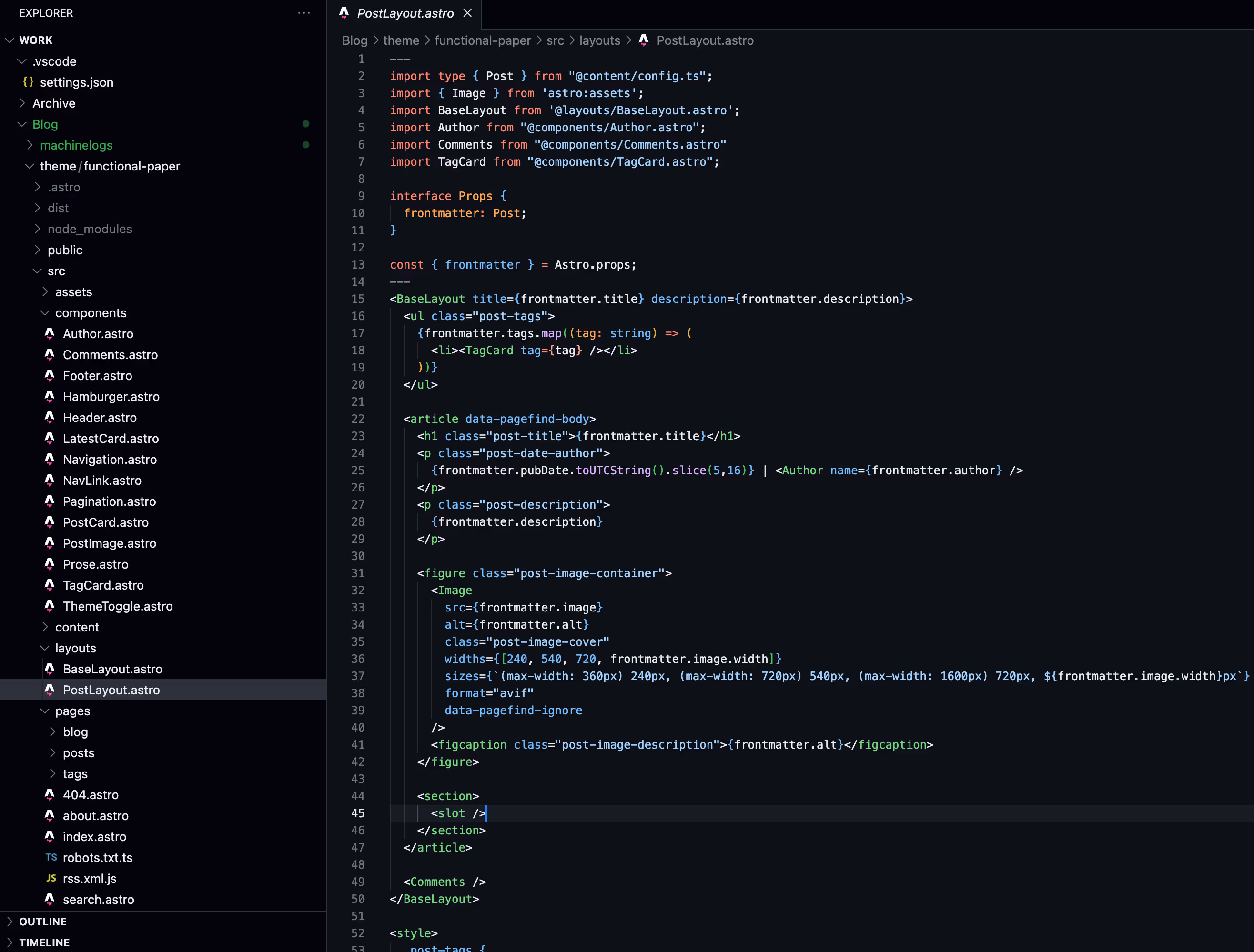
PostLayout.astro is the second defined layout. Itself uses the BaseLayout and some more content before the <slot />. It takes the tags, date, author, description, and image from the post properties and displays those before the slot where the rendered Markdown content will be added.
Pages
Pages can be looked at as instances of layouts, though they can be built from scratch too.
404.astro is the “Not Found” page. Uses the BaseLayout with a simple stylized message.
about.astro is a page where you should talk about yourself, what the blog covers, and what your motivations are, so the readers can build some context. Text can be added using HTML syntax.
robots.txt.ts generates the robots.txt page, which instructs web crawlers, including search engines, which pages can be accessed. It is not part of the normal user journey.
rss.xml.js creates the rss.xml page, providing an RSS feed for those who would like to subscribe to the website. The @astrojs/rss package does most of the work. The following documentation was used to add this feature.
index.astro is the default, or home, page. You can check the URL when you load the home page, and you’ll see that it does not end with /index.html. Most web browsers are configured by default to serve index.html when no specific file path is requested.
The code uses Content Collections to gather the content that needs to be displayed. This integration will be covered in the next Dev Log post. The same applies to the files under the blog, posts, and tags directories. In the next post, we will learn how these are used to generate routes.
search.astro is the place to be when you are looking for something specific. Content from across all posts is searched during a query, and no server-side code is involved. This is possible using Pagefind, which is an integration that we will also cover in the next Dev Log.
Closing Remarks
At first sight, there are many files for a simple theme, such as Functional Paper. But the reason is due to modularity. This makes code reusable and more maintainable. I hope the insights make it easier to understand the source code.
The next Dev Log post will be dedicated to integrations. Three examples among those are Pagefind, Astro Content Collections, and MDX. See you then!